Written by
Juan Carlos Munoz & Carla Capriles
Last Updated
January 13, 2026


Fonts are often treated like decoration, but they’re one of the most powerful tools in your branding toolkit. YouTube’s typography offers a perfect example of how typeface choices, when made intentionally, can shape a global identity. Let’s unpack it in a way that SaaS founders can apply directly to their own products and brands.
YouTube uses Roboto for its UI and an Alternate Gothic Style for its logo. These fonts were chosen for clarity, modernism, and cross-platform performance, principles that every digital brand should keep in mind.
This post unpacks the logic behind YouTube’s typography choices and translates those decisions into actionable insights for SaaS branding. Whether you’re building your first product or rebranding a growing platform, you'll walk away with a sharper eye for what great typography can do.
Typography is a subtle but vital part of your product experience. Users may not consciously notice your font choices, but they definitely feel their effects. Good typography builds trust, boosts usability, and makes your platform feel intentional and mature.
In SaaS, where clean interfaces and strong onboarding matter, your font must carry more than words. It needs to reflect clarity, structure, and brand personality. Poor typography can instantly undermine a user’s perception, no matter how powerful your features are.
Learn more in our post on typography’s impact on brand perception.
Developed by Google, Roboto is optimized for digital interfaces. It offers high legibility, a neutral tone, and excellent performance across mobile and desktop environments. These are all must-haves for large-scale platforms like YouTube, and they translate equally well to SaaS products.
When you use a font like Roboto in your UI, you're reinforcing a commitment to clarity and functionality. It gets out of the way and lets the content shine.
Note: YouTube also uses a custom typeface called YouTube Sans across parts of its ecosystem, especially for brand and display use.
In contrast, YouTube’s wordmark is commonly associated with Alternate Gothic–style condensed grotesks (often cited as Alternate Gothic / Trade Gothic variants), a condensed, bold typeface that commands attention. It’s tight and powerful, making it ideal for logotypes that need to make a quick impression at any size.
For startups, this contrast between UI font and brand mark is a useful model. Pair a flexible body font with a high-impact logo font to create a scalable identity system.
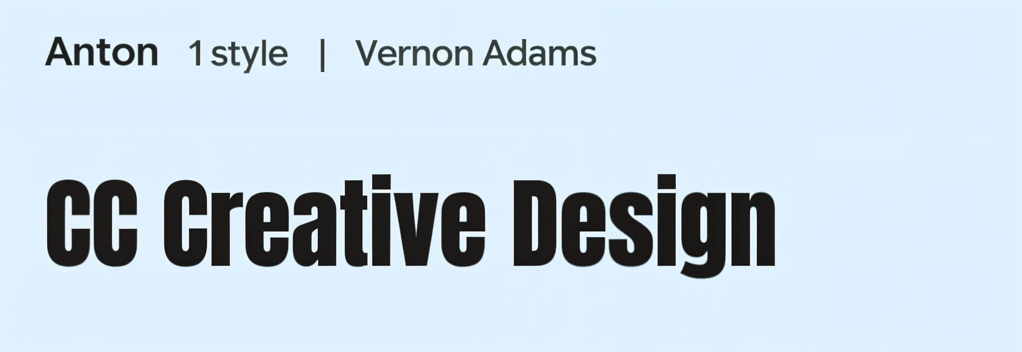
If you Google phrases like “YouTube font,” “YouTube logo font,” or “Youtuber font,” you’ll find a long list of substitutes people use to emulate the YouTube aesthetic. Fonts like Bebas Neue, Anton, or Impact come up often.
But copying style isn’t the same as understanding the purpose. What sets YouTube apart isn’t just the look, it’s how those fonts function. They are clear, scalable, and cohesive across products and platforms.
Startups should adopt that mindset, building systems that unify product and brand expression, not just replicate trends.
Typography isn’t just decoration. It’s design, UX, and branding rolled into one. The best approach is to start mobile-first, ensuring your font remains readable even on the smallest screens.
Next, consider establishing a clear text hierarchy. Use font size and weight consistently to guide the user’s attention and create a predictable reading experience.
The font should match your product's tone. A fintech app may benefit from modern, minimal typography, while a wellness or edtech platform might do better with something friendly and open.
Performance matters too. Always choose web-optimized fonts that load quickly and display well across devices. And once you've chosen your typefaces, apply them consistently across your entire product ecosystem, from your landing page to your in-app dashboard and beyond.
Here are a few standout fonts we often recommend to SaaS clients.
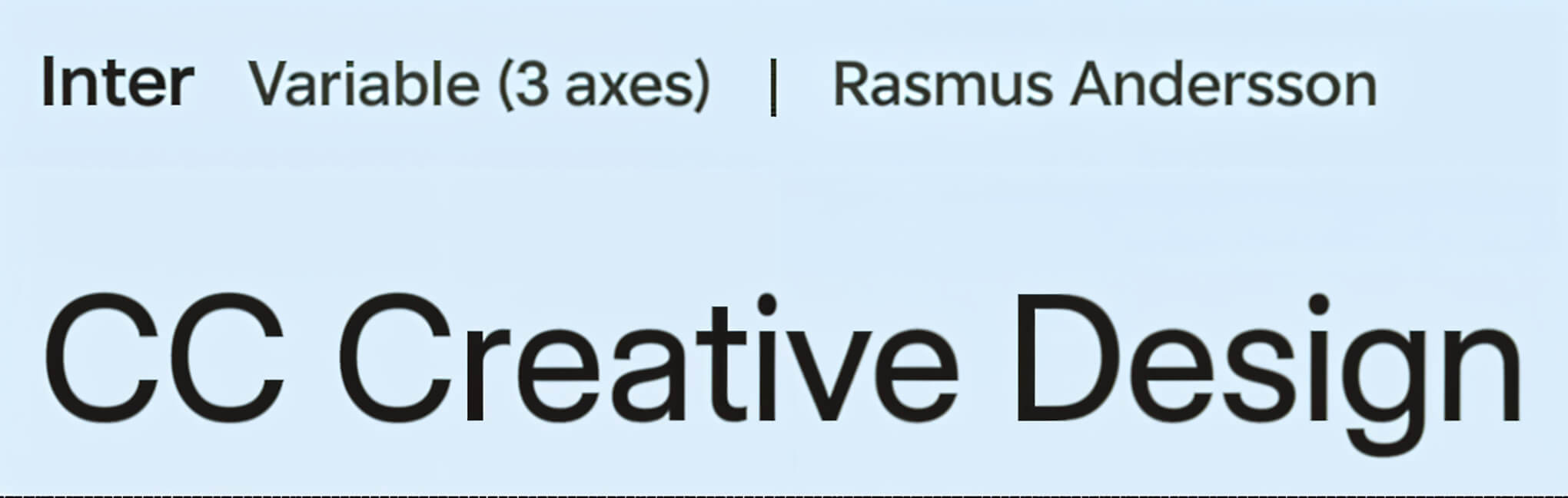
Inter is highly legible and screen-optimized, making it perfect for data-heavy dashboards and dense UI layouts.
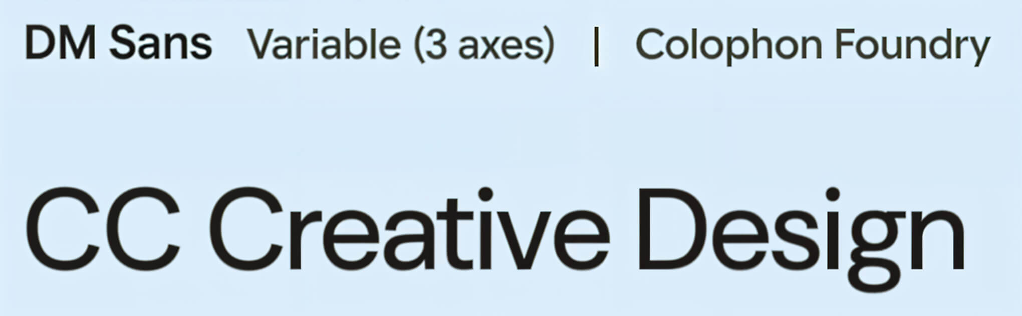
DM Sans is clean, neutral, and works well for platforms that need a professional but approachable tone, especially fintech or productivity tools.
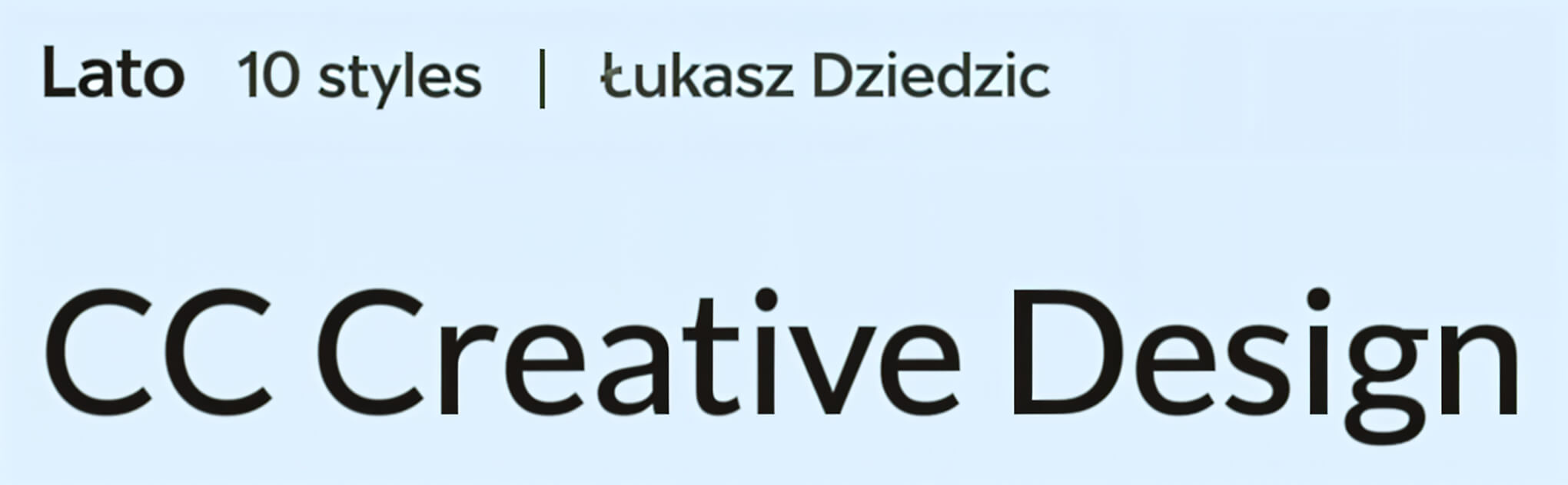
Lato offers friendliness without sacrificing polish, which makes it great for wellness, education, and consumer-facing apps.
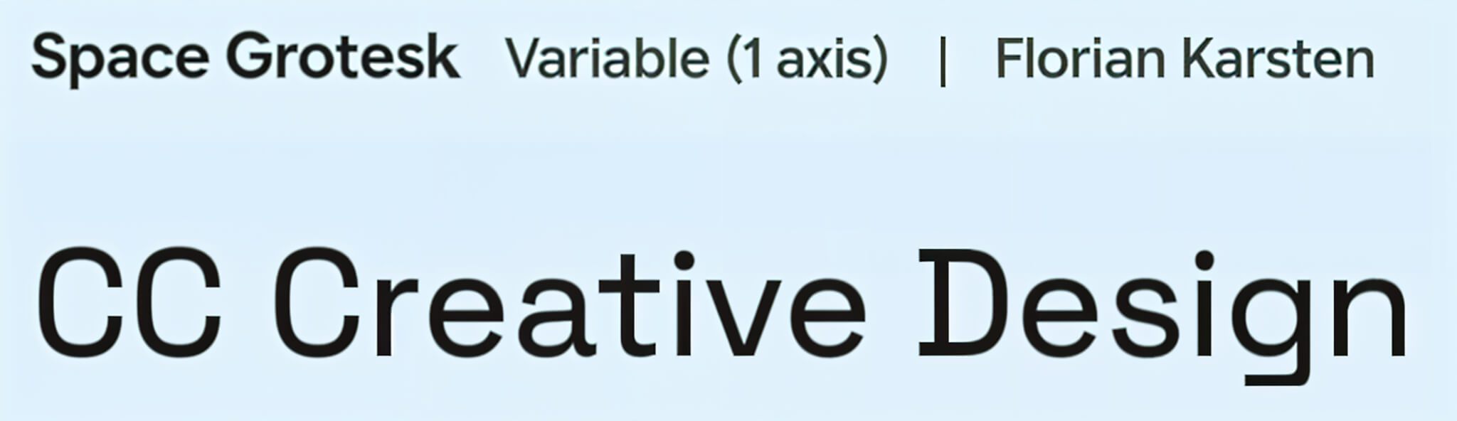
Space Grotesk brings a touch of distinctiveness and works well for creative tools or AI-driven products looking to stand out.
All these fonts are free, available on Google Fonts, Webflow-compatible, and scale well across brand and product interfaces, making them a seamless choice when going from design to development.
Font selection might seem small, but it influences how your product is perceived. Start by clarifying your tone. Do you want to appear bold, calm, technical, or creative?
Then, explore what fonts your competitors are using. This helps you decide whether to follow the industry norm or break from it.
Make sure your chosen fonts are accessible and readable in all conditions. Legibility isn’t optional, especially when serving diverse audiences.
Check the technical fit. The best font in Figma doesn’t matter if it breaks in your CMS or slows your page speed.
Finally, once you’ve made a choice, lock it in. Document your typography system and make sure it’s applied consistently across your product and brand materials.
At CC Creative, we help SaaS founders through this exact process—aligning brand and UX with font systems that scale.
Typography is often silent, but never neutral. As YouTube shows, font choices shape how billions interact with a brand. Your startup might not serve a billion users yet, but it deserves the same level of design intent.
And if you want help getting it right, our team at CC Creative is here for you. We work with product teams to build brands and digital products that scale.
Ready to define your brand’s voice through typography? Book your free audit.
.jpeg)
For start-up founders or growing business owners, apps offer a vast amount of opportunity....
View More.jpg)
A well-designed startup landing page is essential ...
View More.jpg)
Social media can be a great place to connect with friends, keep up with the news and trends ...
View More


