Written by
Juan Carlos Munoz & Carla Capriles
Last Updated
January 23, 2026


Startups are constantly seeking effective ways to stand out in a crowded digital market. With user expectations evolving and visual fatigue from cookie-cutter layouts, design has become a critical differentiator, not just in how a product looks, but how it feels to use.
Brutalism and Neobrutalism are two powerful design strategies. Brutalism strips things down to the essentials: no fluff, just function. Great for platforms that need speed and directness. Neobrutalism keeps the boldness but adds polish and personality, making it a great fit for startups that want both edge and accessibility.
This article breaks down both styles, shares real-world use cases, explores what works best across industries, and helps you decide which design choice supports your startup’s product and growth goals.
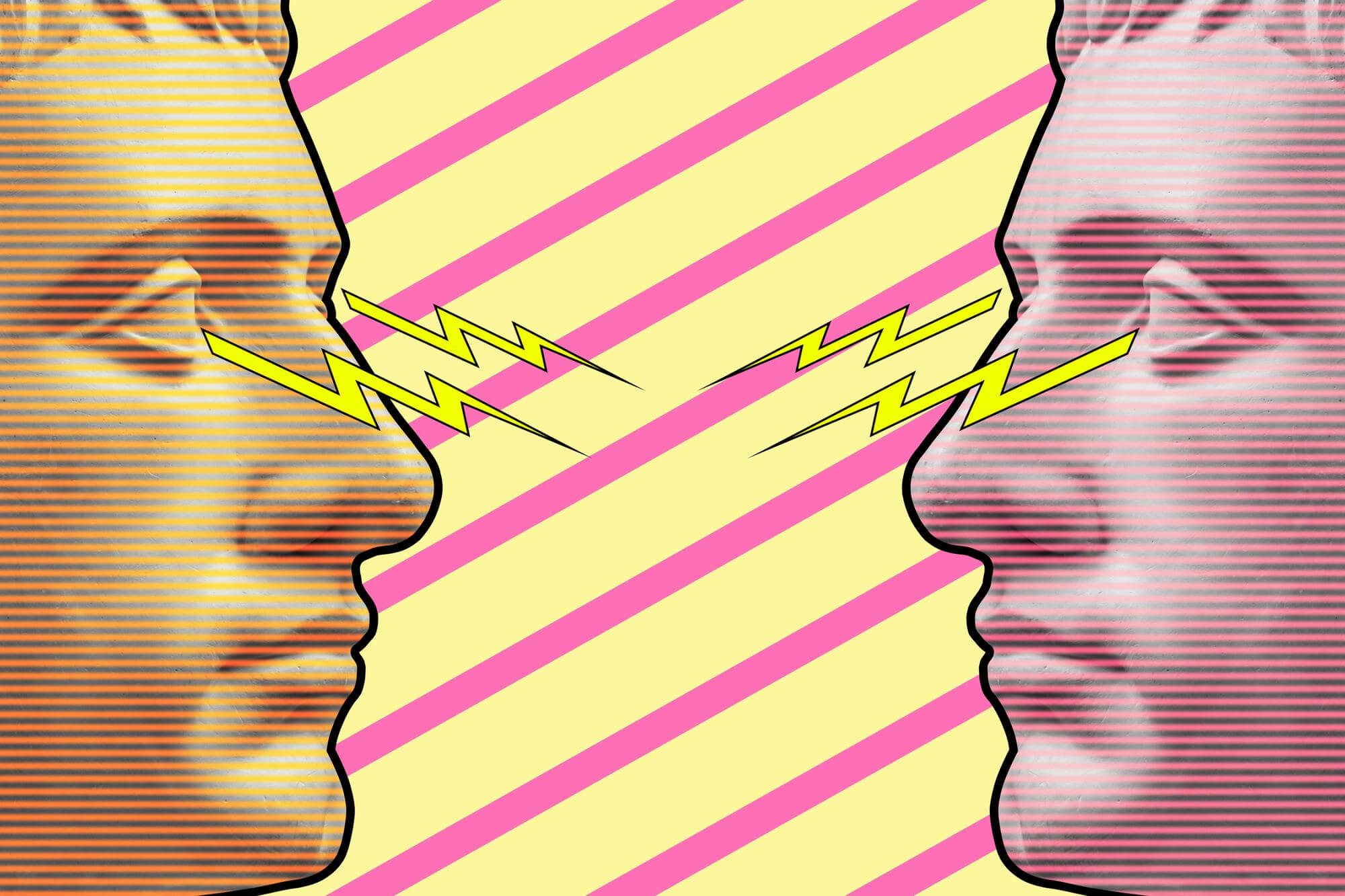
Brutalism in design takes a no-nonsense approach. It embraces raw, utilitarian visuals that prioritize clarity over beauty. You’ll see monochrome color schemes, grid-heavy layouts, generous use of white space, and blunt typography. Elements that strip away polish in favor of honesty.
Brutalist UI became popular around 2015, as early adopters began rejecting over-optimized web trends. The style gained a foothold with content-driven platforms and tech-focused startups who saw value in function-first, minimalist execution.
But it’s not for everyone. While Brutalism earns points for its authenticity and clarity, it can be harsh and intimidating to broader audiences who expect fluid, familiar UX patterns.
Neobrutalism, as the name suggests, is Brutalism’s evolved cousin. This design style emerged around 2020 as a way to maintain authenticity while offering more visual friendliness.
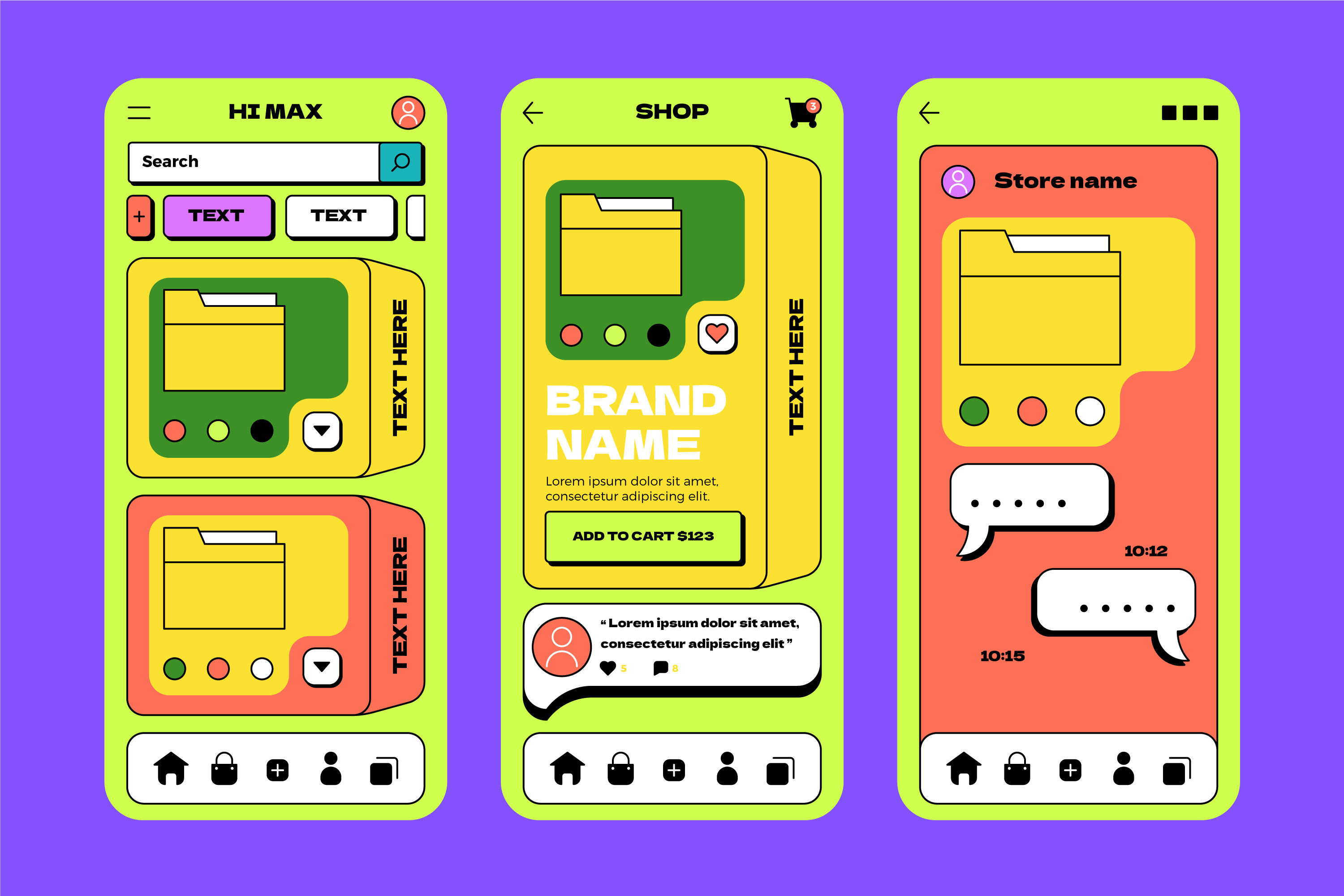
In Neobrutalist design, bold outlines meet playful pastels. Grid-based structures are enhanced with soft shadows, animation, and character. These traits often pair well with muted color palettes, which help balance expression and clarity in modern UI design. The result: a design style that stands out—but doesn’t sacrifice user comfort or engagement.
Startups in SaaS, education, music, and social media often lean into Neobrutalism to balance distinctiveness with approachability. It invites curiosity and keeps users coming back with thoughtful interactive detail, especially when combined with strong typography choices that shape perception and reinforce brand tone.
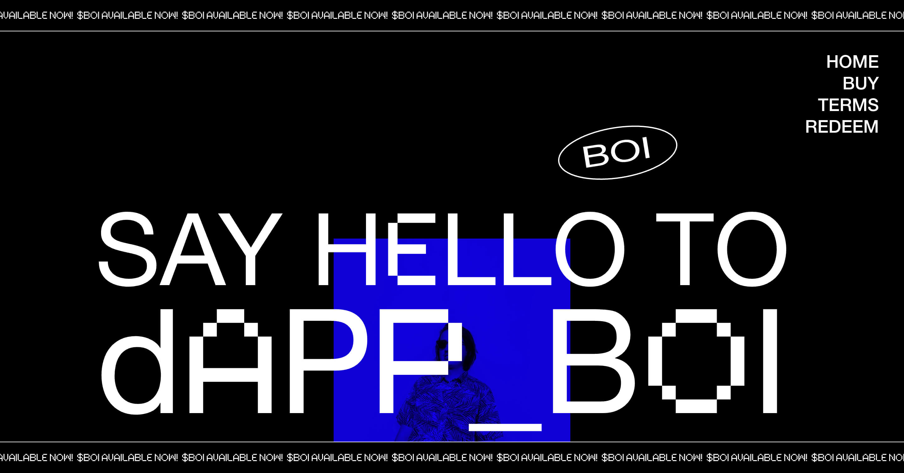
A more intentional example of digital Brutalism is Ezequiel Aquino’s personal portfolio, which fully embraces raw HTML aesthetics, sudden layout shifts, minimal styling, and stark monospaced typography. Every element feels deliberate and expressive, prioritizing honesty and individuality over elegance or convention.
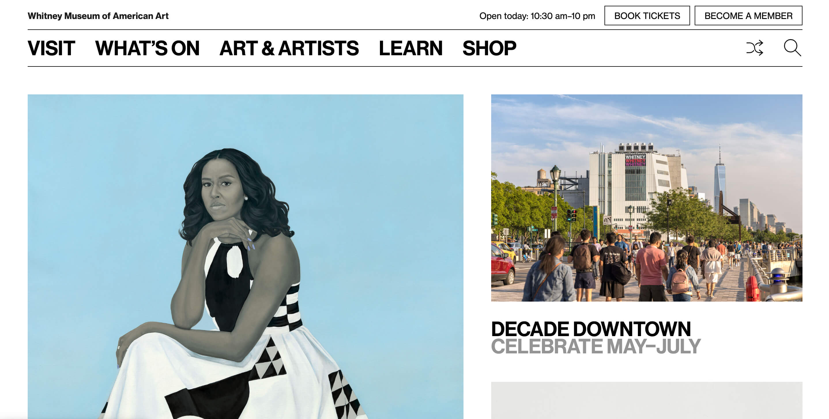
Another strong example of Brutalism is the Whitney Museum website. It’s rough, direct, and stripped of unnecessary visual elements, allowing the art and content to take center stage. It fully embraces the essence of functionality over polish.
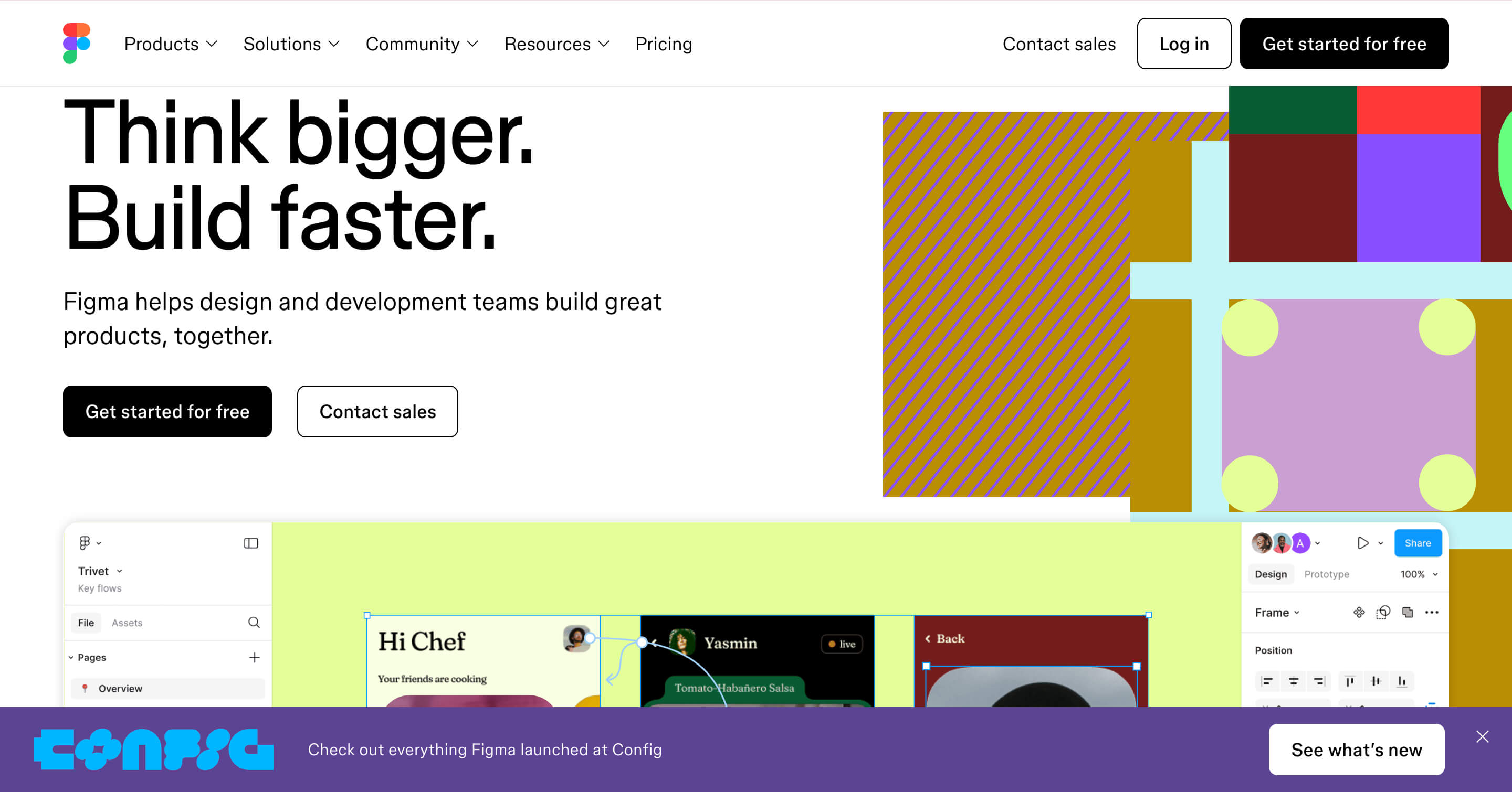
On the flip side, Figma offers a more fitting example of Neobrutalist design. While not strictly labeled as such, many of its interface choices like bold outlines, flat surfaces, vibrant accent colors, and purposeful grid usage, lean into Neobrutalist aesthetics. It strikes a balance between playful and professional, showing that functional tools can still have character.
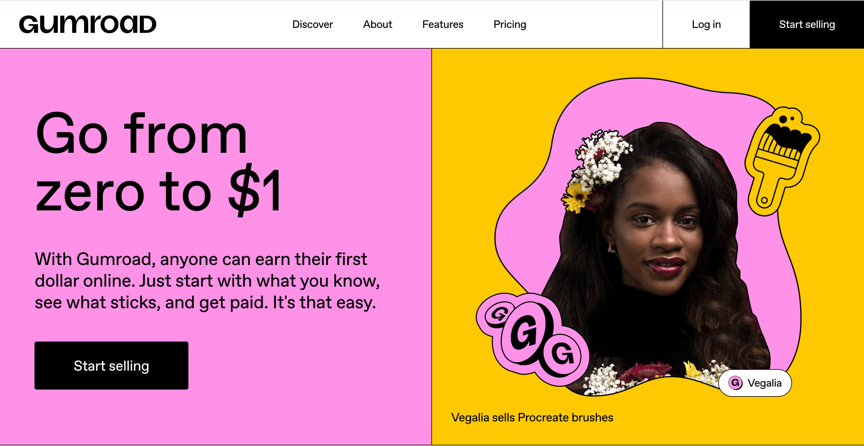
Another great Neobrutalist example is Gumroad. Its oversized headline and bold layout nod to Brutalism, but its color palette, typography, and polished UI elements elevate it into Neobrutalist territory.
For more industry-aligned examples:
If your brand is about bold moves, clarity, and raw functionality, Brutalism may be your perfect match. It's ideal for fintech, blockchain, or niche tech platforms that serve users who value speed, transparency, and efficiency.
That said, the right design decision isn’t just about aesthetic preference. It’s about aligning your UI with your audience, content, and brand message.
If your users are younger or more tech-savvy, they might resonate with the rawness and authenticity of Brutalism. For a more mainstream or brand-conscious audience, Neobrutalism’s balance of structure and personality may connect better.
If your platform is content-heavy with lots of text, articles, or utilities, Brutalism’s stripped-back style can help keep focus. Neobrutalism, meanwhile, thrives on visual storytelling, animations, and more expressive design systems.
If you want to convey boldness, disruption, or transparency, Brutalism makes a strong statement. If your tone leans toward warmth, refinement, or a friendly polish, Neobrutalism allows more nuance without losing personality.
Neobrutalism is especially well suited for startups in industries like nutrition, education, social media, or fitness. Its playfulness, accessibility, and polished UX are ideal for products that require trust, engagement, and emotional resonance.
The biggest UI design trends of 2026 like micro-interactions, bold personalization, and evolving visual styles such as neumorphism and glassmorphism all fit neatly into the Neobrutalist playbook.
Startups adopting playful visual elements, interactive micro-animations, and inclusive design often rely on accessibility best practices. These decisions typically result in user satisfaction, retention, and engagement.
Choosing between these styles isn’t just a design decision, it’s a make-or-break moment for how users experience your product. Your UI speaks before your product does.
Whether you need to go bold and raw with Brutalism or playful and polished with Neobrutalism, we’ll help you execute it with intention. At CC Creative, we specialize in UI/UX design, branding, and Webflow development tailored specifically for startups ready to scale fast and look sharp doing it.
Let’s turn your product vision into a UI that users remember—and convert on.
Both Brutalism and Neobrutalism offer distinct advantages depending on your brand’s voice, audience, and product type. The choice isn’t just visual, it’s experiential.
Brutalism is confident, raw, and functional. Neobrutalism is bold, modern, and engaging. Knowing your users and choosing the right visual system could be what sets your startup apart in a crowded market.
If you’re ready to define your brand through a UI that’s not just visually distinct but also strategically effective, let’s talk. We’ll help you bring your design vision to life so your product doesn’t just look great, it converts.
.jpeg)
For start-up founders or growing business owners, apps offer a vast amount of opportunity....
View More.jpg)
A well-designed startup landing page is essential ...
View More.jpg)
Social media can be a great place to connect with friends, keep up with the news and trends ...
View More


