Written by
Juan Carlos Munoz & Carla Capriles
Last Updated
January 13, 2026


Color decisions impact everything, from how your product feels to how usable it is. Yet many startups pick palettes based on trend, taste, or tools that generate random combos. That’s where a structured, goal-driven approach comes in.
A strategic UI color palette is a system of colors, built from your brand's personality and UX needs, that ensures clarity, consistency, and accessibility across your product.
In this guide, we’ll show you how to build a palette that works, from choosing a primary color to defining interaction states. The focus here is on creating a practical, scalable palette that improves usability, clarity, and conversion. Let’s dive in.
Color isn’t decoration. It’s communication. Before users even read your copy, your colors are already telling them how to feel.
Red feels urgent or bold, great for CTAs, but risky if overused. Blue builds trust and stability, which is why so many banks and fintechs rely on it. Yellow grabs attention but can be fatiguing on the eyes, so it’s best used in moderation. Green signals growth and confirmation, often used in success states and progress indicators.
But color theory isn’t just about emotional psychology. It’s also about contrast, accessibility, and how colors interact. That’s where thoughtful palettes come in.
Every strong UI palette has a structure. At its core, you need a primary color that drives your brand, a secondary that offers support or variation, and a neutral range for surfaces, backgrounds, and text.
You’ll also want an accent color to draw attention in small doses, think alerts or CTAs. And lastly, you’ll need clear and consistent states for success, error, warning, hover, and disabled elements.
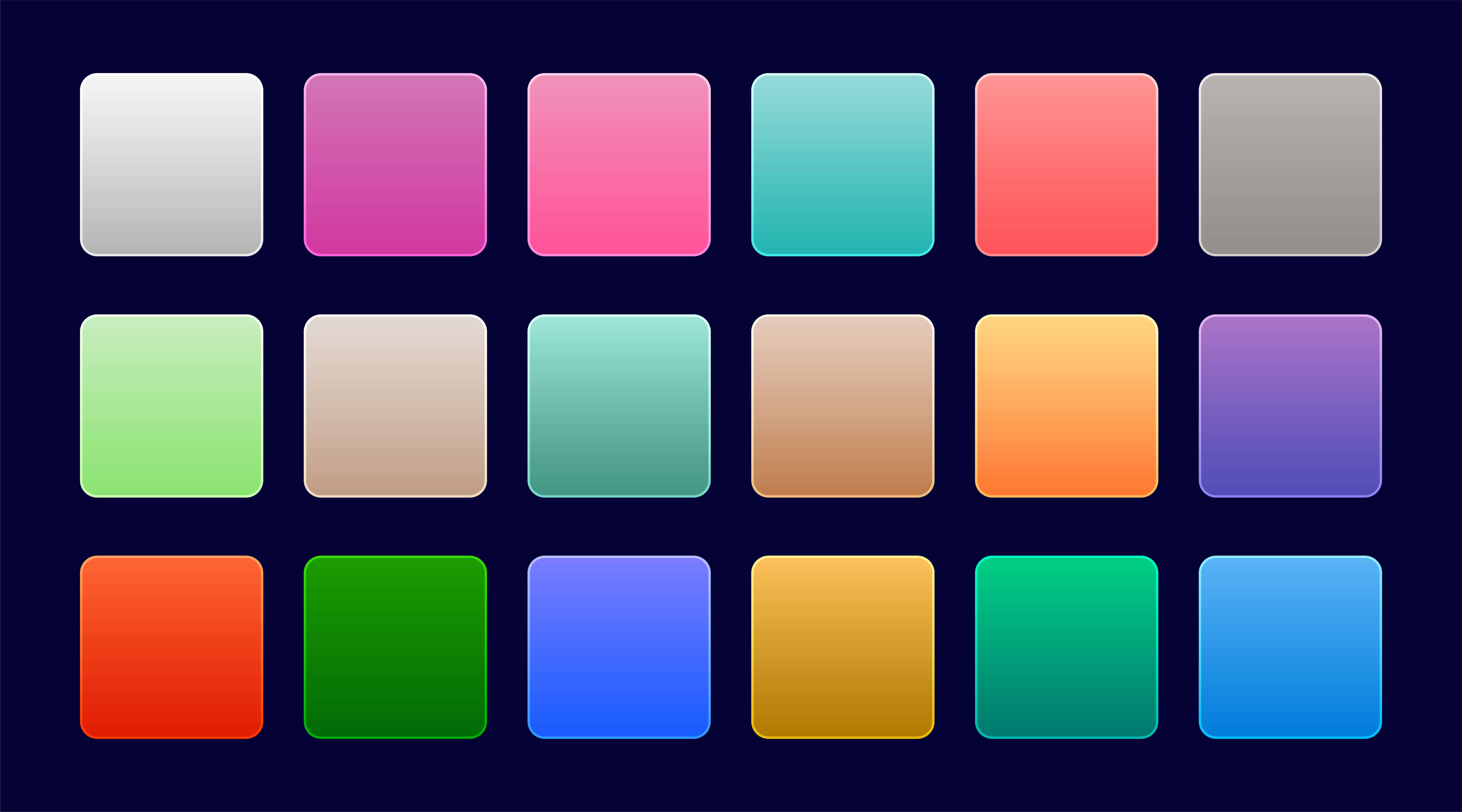
Having a palette isn’t enough, you also need depth. That means building out tints and shades, often on a 100–900 scale. Using one hex code across your product leads to flat, inconsistent visuals. Depth brings hierarchy and professionalism.
Color should support action. If your brand is energetic and loud, your palette can be punchy and expressive. If your goal is to build trust or communicate precision, you’ll want cooler, calmer tones.
Consider your competitors, but don’t just follow them. You want to stand out while still aligning with what your audience expects in your category.
Contrast is a non-negotiable. Your CTA buttons, forms, and alerts must be visible and clear across all screens. A/B testing in real interface contexts not just mood board, is crucial.
When we help founders choose their palette, we usually walk through three questions.
First, how do you want your product to feel? Choose three words, like “friendly,” “professional,” or “bold”, and anchor your choices in those traits.
Second, what does your UI need to do visually? If it’s CTA-heavy, lean on bold contrasts. If it’s content-heavy, aim for calm tones that reduce fatigue.
Finally, stress test your colors. View them across breakpoints, check them in light and dark modes, and run them through accessibility tests.
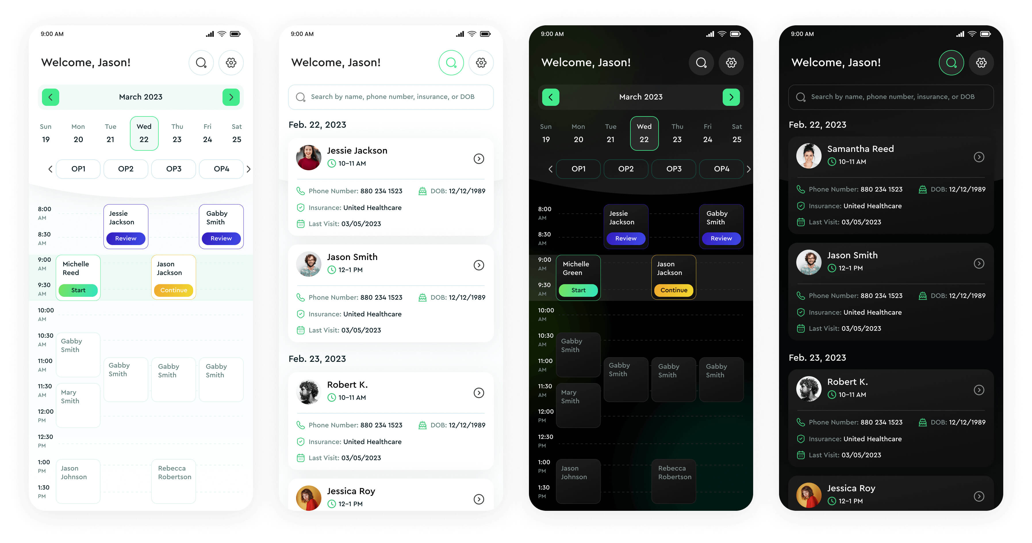
Your color system should reflect who you are. Stripe uses a futuristic blend of blue gradients and deep purples to say, “we’re advanced, but reliable.” Notion, in contrast, strips everything back to black and white, underscoring simplicity and focus.
These aren’t accidents. They’re signals.
Color amplifies brand positioning. If you’re disruptive, your palette should push boundaries. If you’re building for trust, stability, or care, your palette should reflect that too.
At CC Creative, we always begin by defining brand archetypes and emotional tone before touching color.
The colors that work in fintech rarely work for fitness. Industry matters.
Nutrition brands often lean into soft greens and natural hues—colors that suggest freshness and transparency.
Sports startups go bold with reds, blacks, and powerful contrast to evoke energy and movement.
Education favors calm, structured palettes in blues and purples, tones that build trust while keeping learners focused.
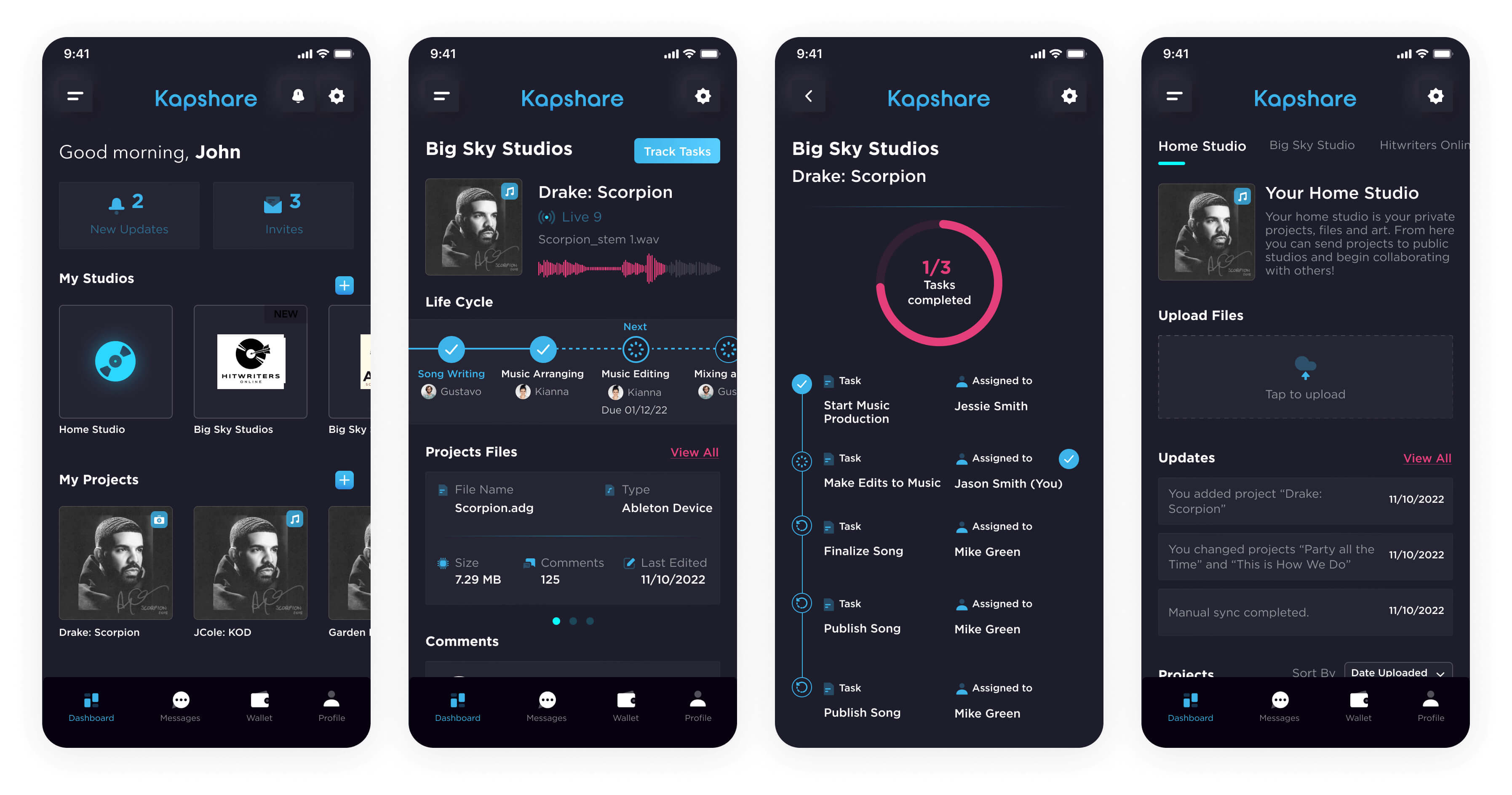
Music platforms lean darker and moodier, with vibrant accents that pop against muted backgrounds.
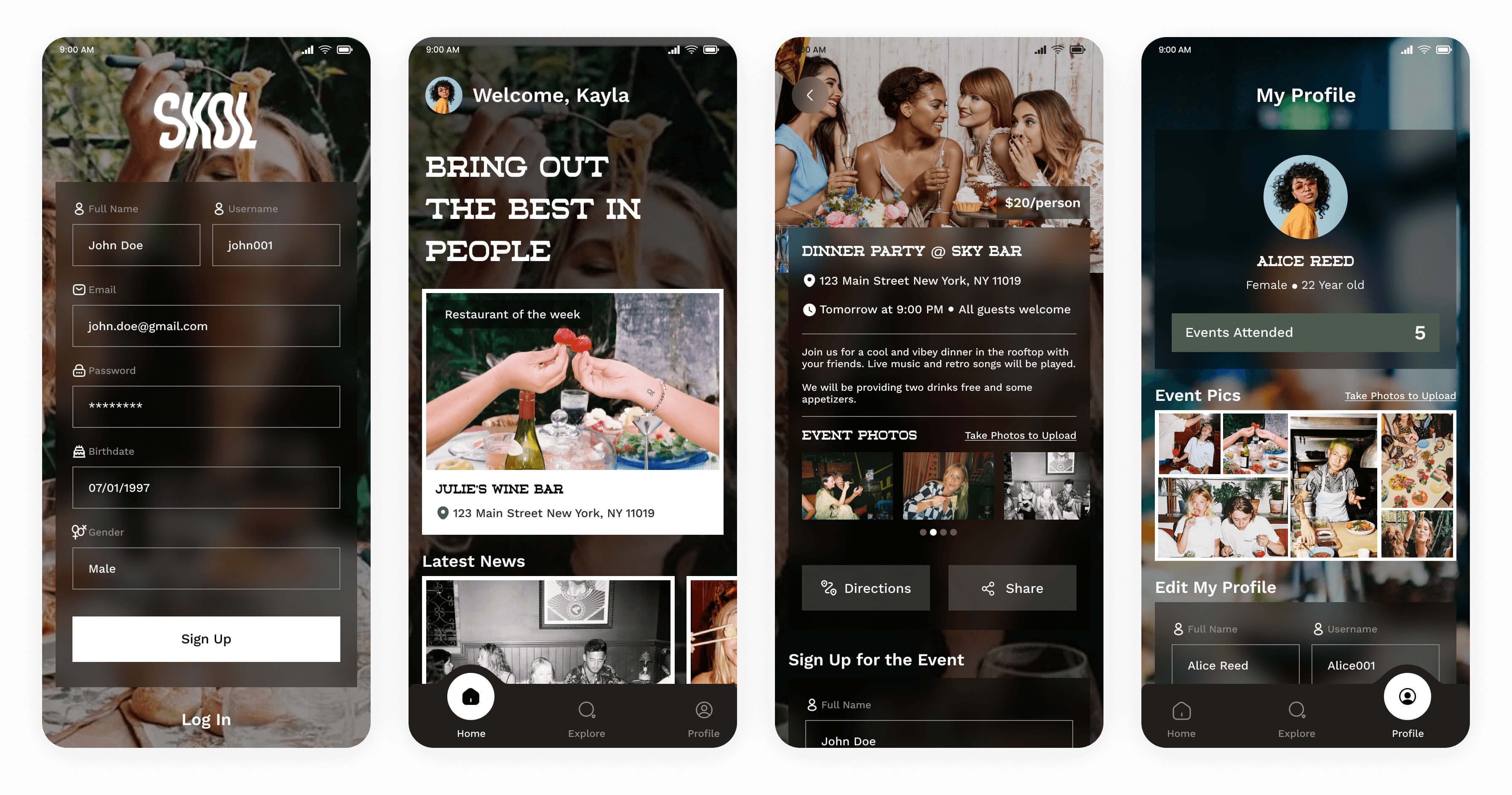
Social media startups use bright, friendly colors like teal, coral, or lavender to suggest connection and approachability.
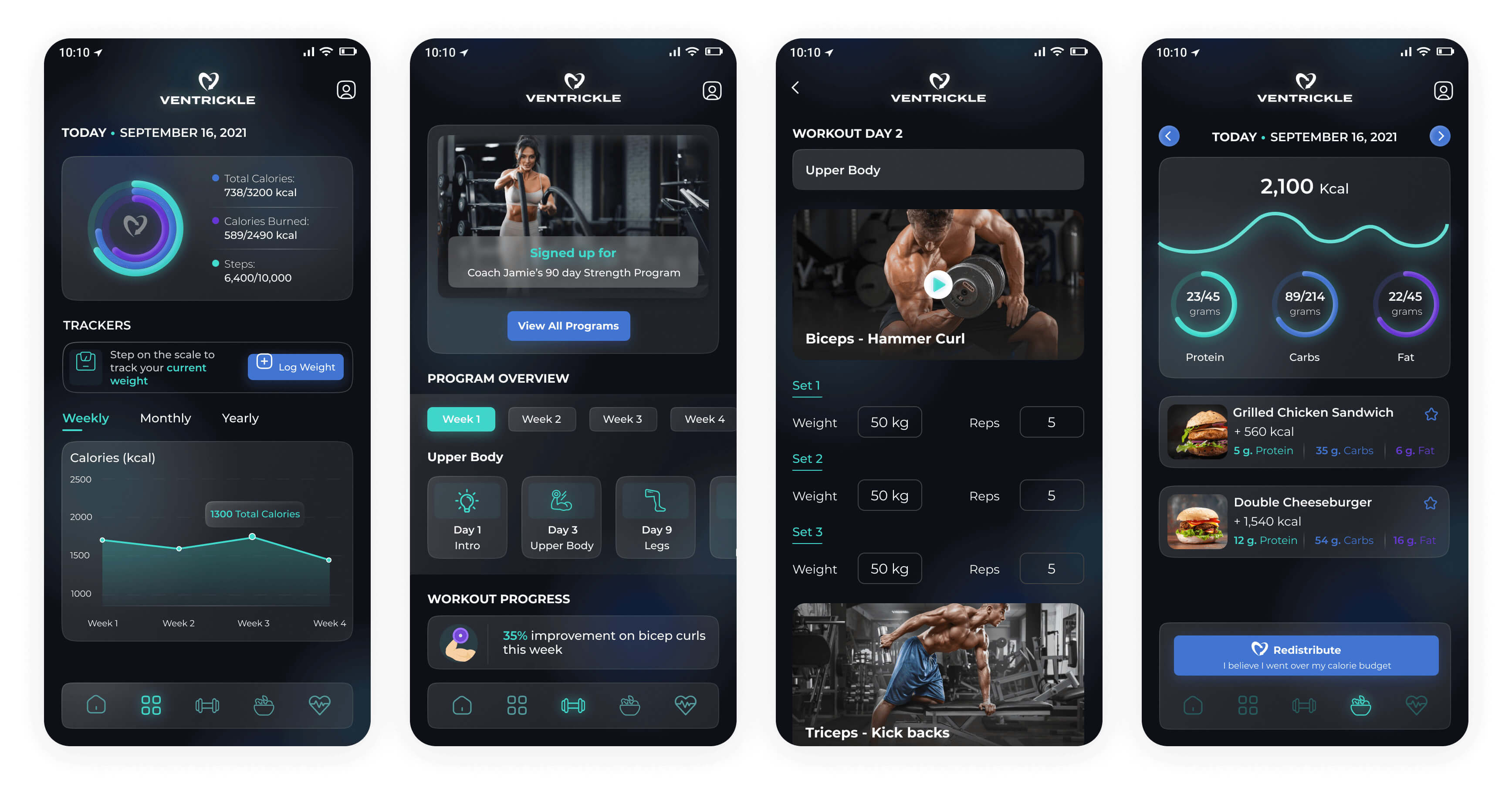
Fitness brands prioritize urgency and performance, think electric greens or deep reds.
Blockchain and tech-forward platforms use futuristic hues like indigo, gradients, or cyan-leaning blues.

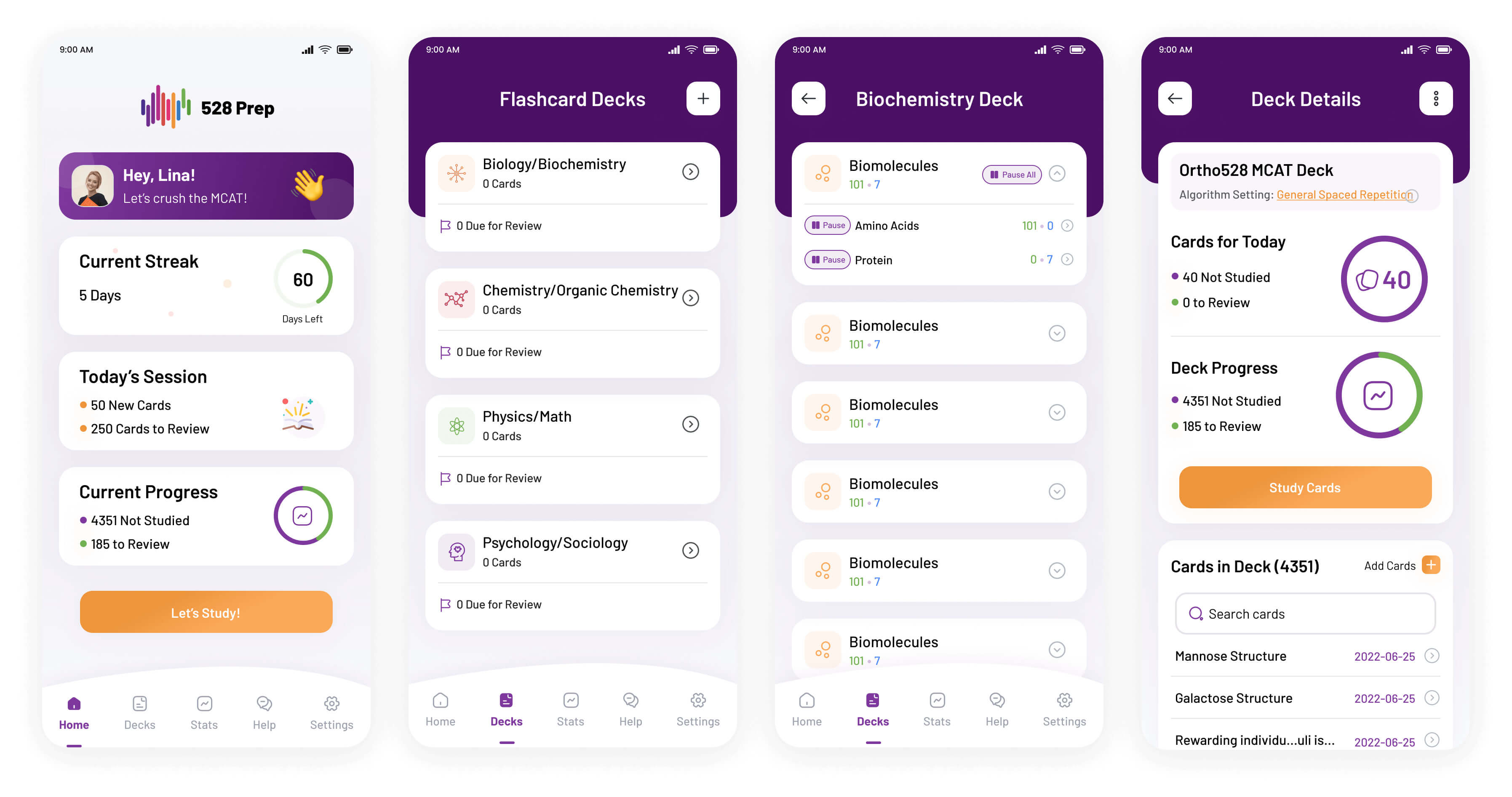
Meanwhile, fintech sticks with navy, gray, and cool tones to build a sense of security.

Healthcare favors light, calm palettes with soft blues, greens, and white space to signal cleanliness and care.
Founders often treat color as personal preference. They pick a favorite shade and build around it. But a UI color palette needs to serve users first.
Another common issue: skipping a neutral system. Without it, everything competes for attention and nothing feels grounded.
We also see palettes with low contrast or inaccessible combinations. That doesn’t just hurt usability, it can push away a significant portion of your audience.
And finally, too many colors can backfire. If every element is screaming, the user doesn’t know where to look.
Accessibility is foundational. Good design includes everyone, and color contrast plays a big role.
To meet WCAG guidelines, aim for a 4.5:1 contrast ratio for body text, and 3:1 for larger types. This ensures users with vision impairments or color blindness can navigate your interface without friction.
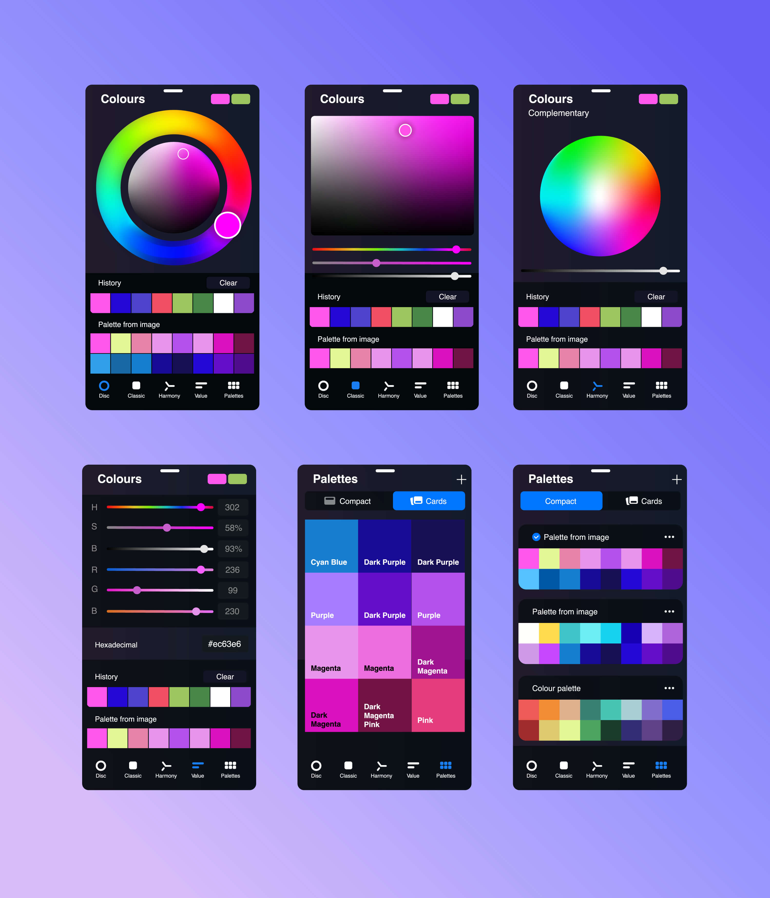
Tools like Stark (a Figma plugin), WebAIM’s contrast checker, and Contrast Grid are essential to validate your choices.
Accessibility is more than a checkbox, it’s a competitive advantage that builds trust and reach.
Want to explore how colors work together using principles like complementary, analogous, or monochromatic harmony? We cover that in detail in our separate guide, Color Harmony in Design. It’s the perfect complement to this article if you're focused on crafting mood, balance, and visual emotion through color.
We use these religiously when crafting UI systems for our startup clients:
At CC Creative, we design color systems that aren’t just pretty, they’re strategic. Whether you’re launching your MVP or rethinking your brand UI, we can help build a palette that connects with users and converts.
If you want tailored feedback or hands-on help, book a free 15-min consult. We’ll take a look at your product and walk through what color strategy makes sense for your goals.
Let’s make color your secret weapon.
Color decisions don’t have to be overwhelming. When grounded in your brand’s identity and user goals, your palette becomes a tool, not just a style choice.
It sets the tone, shapes behavior, and builds trust across every screen. When chosen intentionally, color creates consistency across your product, marketing, and overall experience.
At CC Creative, we believe design systems should evolve with your startup. A strong color strategy supports that growth, not just by looking good, but by guiding real user interactions.
If you're building something meaningful, your colors should carry that same purpose. We're here to help you make that happen with clarity and confidence.
.jpeg)
For start-up founders or growing business owners, apps offer a vast amount of opportunity....
View More.jpg)
A well-designed startup landing page is essential ...
View More.jpg)
Social media can be a great place to connect with friends, keep up with the news and trends ...
View More


