Written by
Juan Carlos Munoz & Carla Capriles
Last Updated
December 8, 2025


Your product’s UI is more than just aesthetics—it’s the first impression, the trust builder, and the silent persuader. Getting the interface right for SaaS and startup founders means better engagement, retention, and conversion in a rapidly evolving design landscape, and staying current matters.
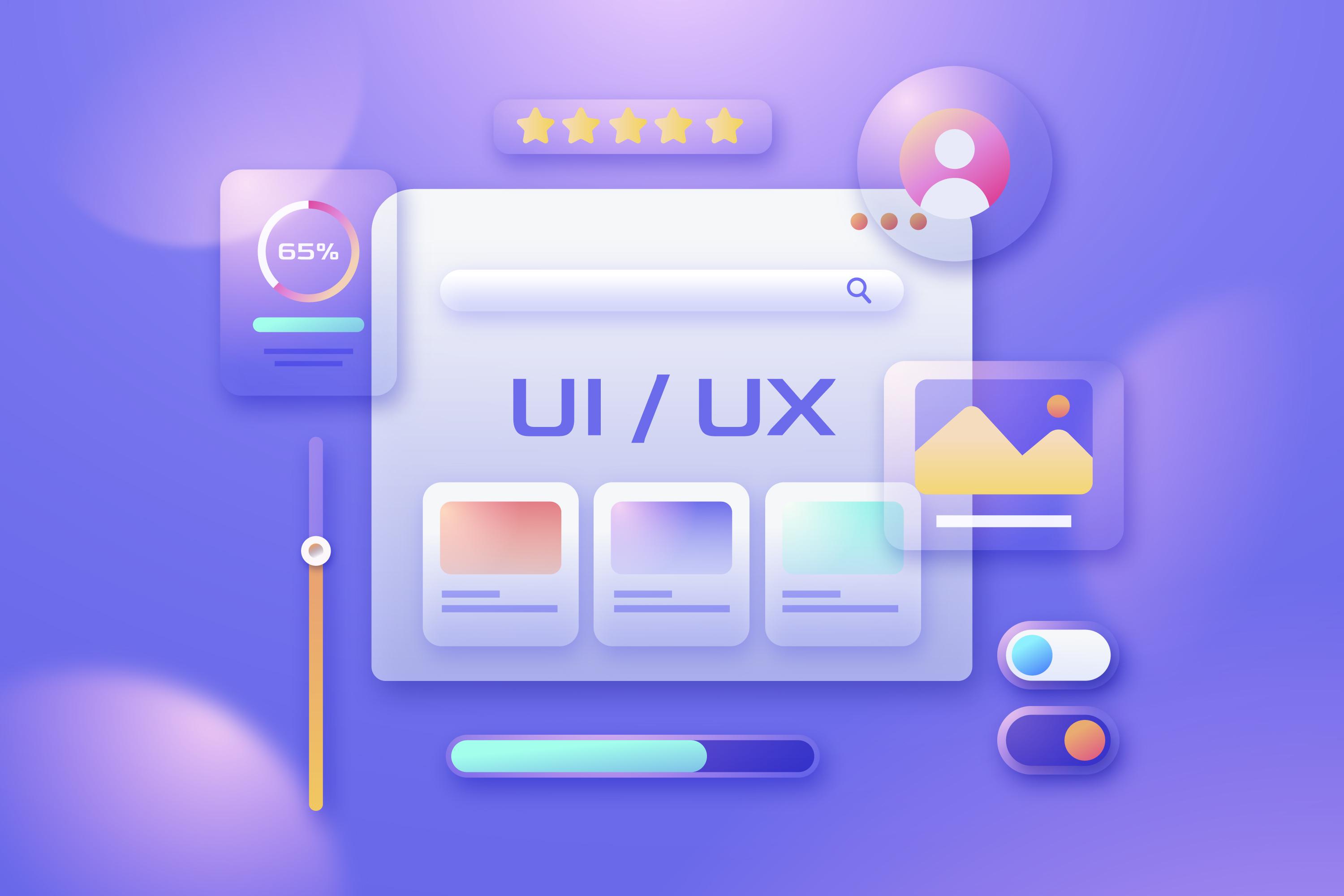
In 2025, the top UI design trends are Neumorphism, Glassmorphism, and Neubrutalism. Each offers a unique look and feel, and this guide helps you understand when and how to use them to create interfaces that resonate with your users and reflect your brand.
From trend breakdowns to real examples and strategic advice, this guide is built to help you make the right UI choice for your product—whether you’re going minimalist, modern, or bold. Let’s dive in.
Your product’s design sets the tone—before anyone reads a word or clicks a button. When users land on your app or site, the interface is their first signal of quality. In the SaaS world, where choices are endless and attention spans short, design that feels fresh, trustworthy, and relevant can make or break the experience.
That’s why UI trends matter. A thoughtful, up-to-date interface lowers user friction, builds trust through familiar patterns, and helps your brand stand out in a competitive market.
Great design isn’t decoration—it's a conversion strategy in disguise.
Neumorphism—or Soft UI—is a reimagining of skeuomorphism with modern subtlety. It blends soft gradients, inner and outer shadows, and minimal contrast to create depth without noise.
It’s often used to make buttons, cards, and inputs appear tactile—like they’re molded from the interface itself. Think health apps, productivity tools, or dashboards aiming for a calm, intuitive aesthetic.
Neumorphism uses gentle shadows and low-contrast color palettes to make UI elements look subtly raised or recessed. Think soft buttons that look touchable, but not flashy.
It’s instantly modern and creates a calming, tactile experience. For minimalist tools or wellness apps, it adds just enough visual interest.
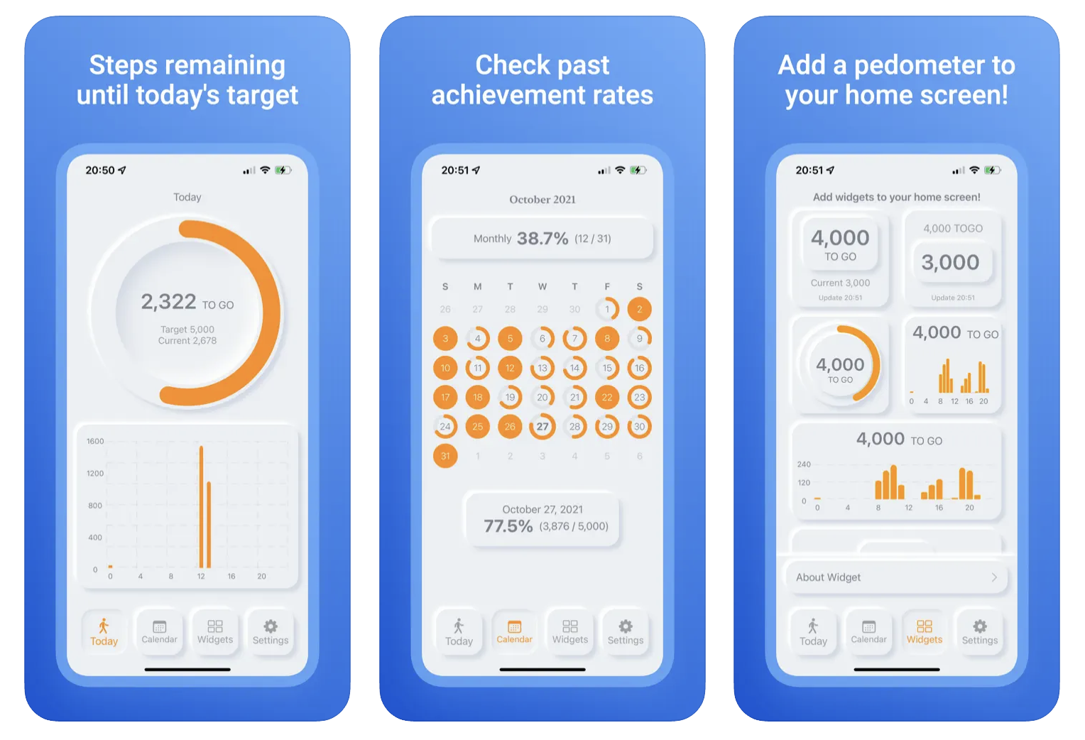
A great example of Neumorphic design in action is the More Steps clock app. Its consistent lighting and gentle shadowing give key components a soft, dimensional feel that subtly lifts them off the screen. As with many implementations of Neumorphism, this style is often best suited for specific interface elements—like cards, buttons, or utilities—rather than full-page layouts.
If your focus is on maximizing accessibility, you may want to lean toward styles with stronger contrast. However, Neumorphism still excels as a visual styling tool for creating calming, tactile interfaces. It’s ideal for minimalist tools and wellness apps where softness enhances clarity without visual overload. Use strong typography and subtle contrast to bring out its best features. Learn how we apply it in our custom UI design services.
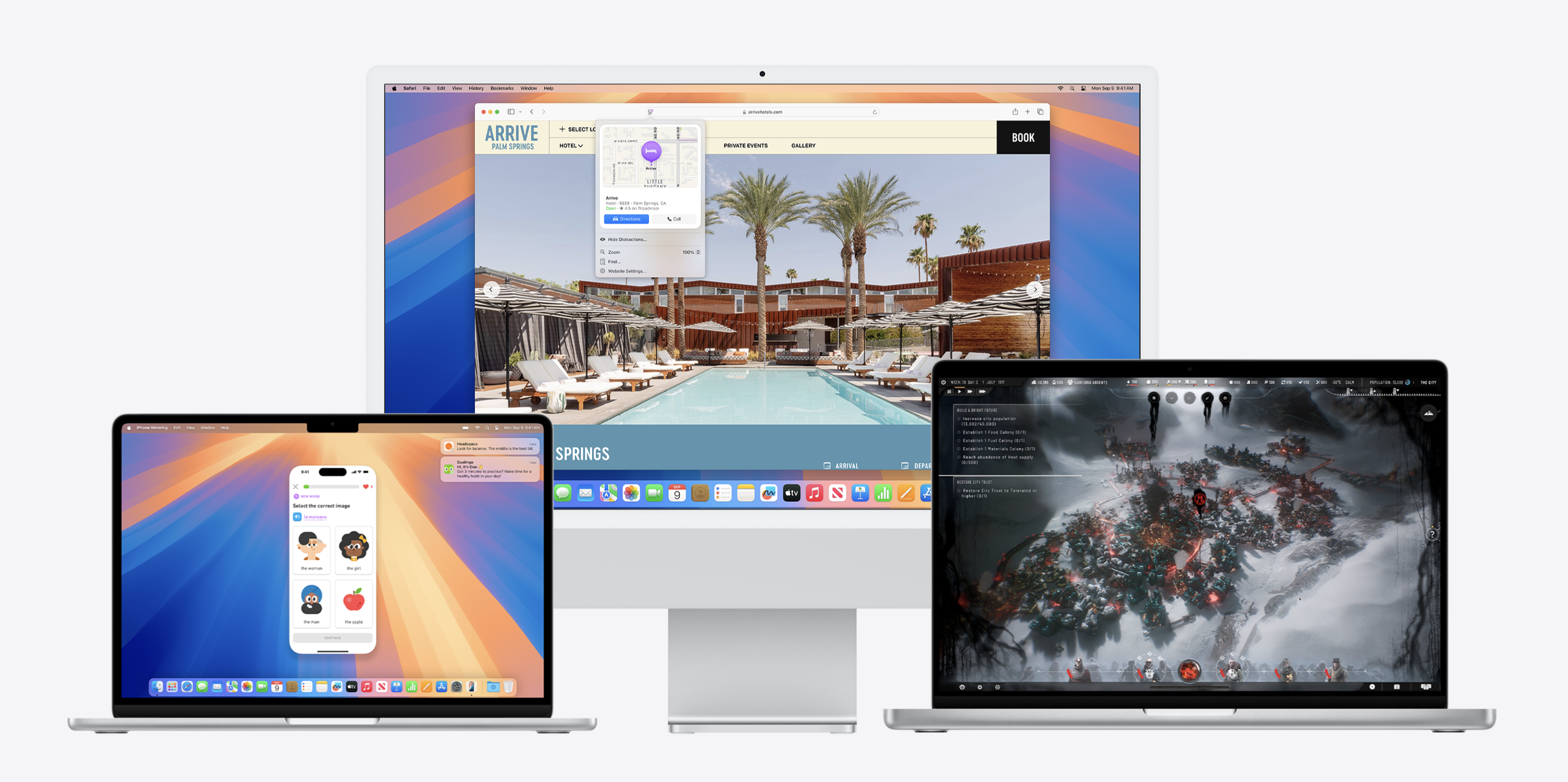
Glassmorphism adds sleekness and sophistication to interfaces by mimicking the look of frosted glass. It uses blur, transparency, and layered backgrounds to simulate depth while maintaining elegance.
This trend can elevate a product’s visual identity—especially when used in hero sections, data dashboards, or feature cards. When done right, it makes the user interface feel both high-tech and approachable. It combines transparency, blur, and vibrant backgrounds in a way that feels futuristic but still functional.
It combines transparency, blur, and vibrant backgrounds in a way that feels futuristic but still functional.
Glassmorphism layers translucent cards over blurred backgrounds, often with soft borders and vibrant gradients. It mimics the frosted-glass effect you’ve likely seen in modern operating systems.
It feels premium. When used sparingly—especially on hero sections or dashboards—it adds a futuristic polish without sacrificing function. For a closer look at how Glassmorphism has evolved—and when it works best—check out our blog post on Glassmorphism.
Apple’s macOS and Webflow’s design templates have embraced this trend for its dimensional layering and clarity. If you're building in Webflow, our Webflow development services can help you incorporate this trend seamlessly.
Glassmorphism delivers visual depth and sophistication when used thoughtfully. If accessibility is a top priority, just avoid placing blur over important text or buttons. When paired with clear typography and contrasting backgrounds, it maintains elegance while keeping interfaces usable across a wide audience.
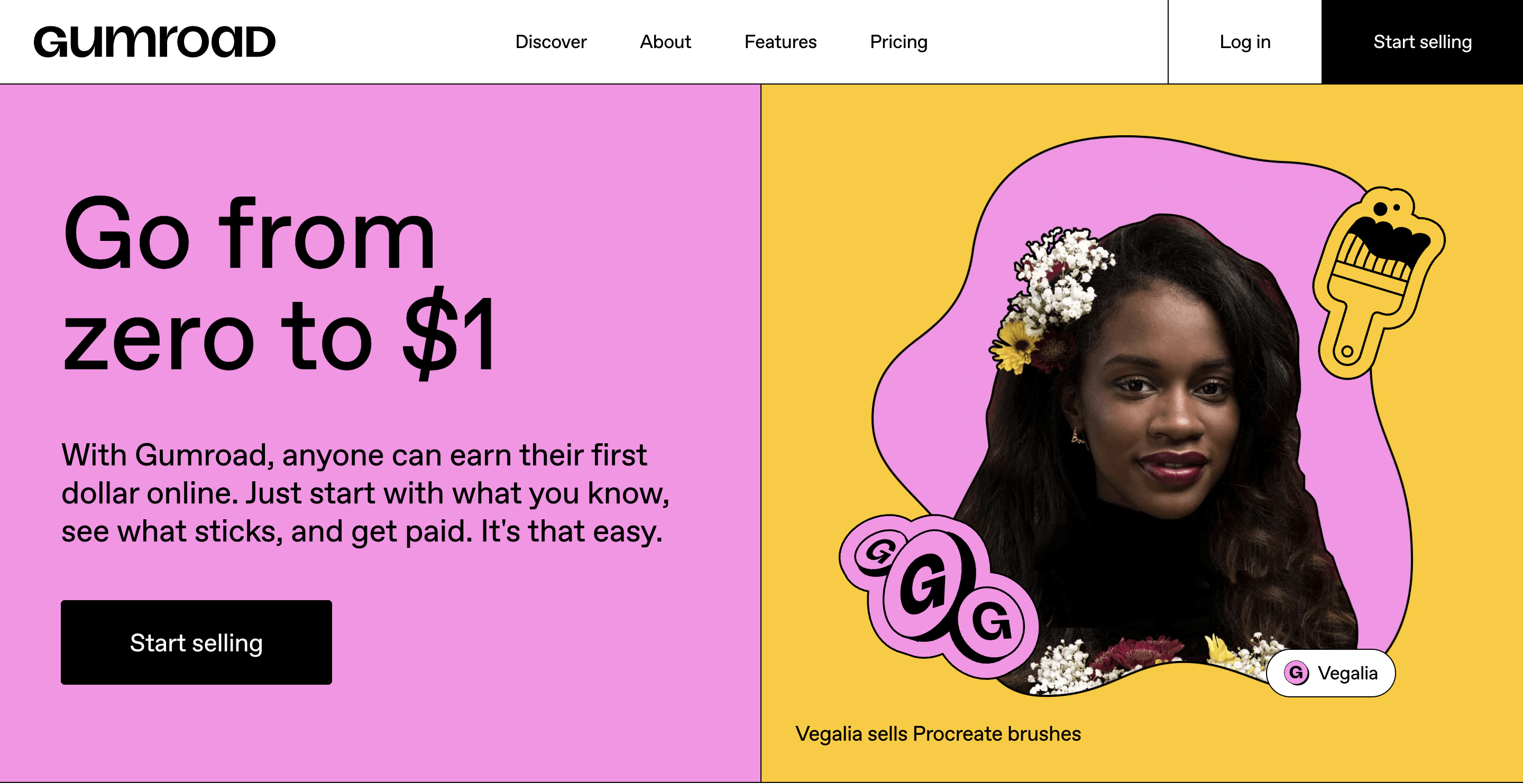
Neubrutalism doesn’t whisper—it shouts. It embraces deliberate harshness: rigid grids, mismatched fonts, thick outlines, and saturated colors. It challenges what’s expected of digital aesthetics.
It’s not just about being bold for bold’s sake. It creates a raw, honest visual language that can deeply resonate with niche audiences and disrupt norms in markets full of safe, muted UI.
Yet underneath the visual noise is a foundation of clarity. High contrast and simplified layouts make it surprisingly user-friendly.
Neubrutalism pairs bold colors with chunky outlines, heavy shadows, and layouts that intentionally break traditional design rules. It’s raw, expressive, and sometimes chaotic—but that’s the point.
This trend grabs attention fast and stands out in a sea of clean, predictable UIs. It’s also inherently accessible thanks to strong color contrast and exaggerated element boundaries.
Design-forward sites like Gumroad and our own CC Creative site use Neubrutalism to reinforce creative confidence. This approach resonates especially with developer tools and indie products that embrace nonconformity and want to stand out visually.
Neubrutalism is naturally accessible thanks to its strong contrast, sharp geometry, and clear type hierarchy. If your product requires strict clarity—such as data dashboards or dev tools—this style can support both function and flair. It’s a bold visual approach, best paired with brands that thrive on authenticity and disruption. Its raw aesthetic makes a strong first impression.
Use it intentionally. Curious how Neubrutalism evolved from its architectural roots? We explored that in our breakdown of Brutalism vs Neubrutalism in UI Design.
If your startup’s tone is bold, quirky, rule-breaking, or if you want to stand out and be unique, Neubrutalism might be your visual soulmate. Just make sure your brand foundation supports it. If you're unsure, our branding services can help clarify your visual voice.
Also consider who you're designing for. Creative users might love visual flair. Enterprise customers might prefer sleek and minimal. Complex workflows need clarity above all. And of course, accessibility should never be compromised—no matter the trend.
At CC Creative, we help founders strike the balance between trend-forward design and timeless UX principles.
Trends should inspire, not dictate. Just because something is hot in 2025 doesn’t mean it fits your brand or users. The best UI isn’t trend-first—it’s user-first.
Some things never go out of style: clarity, contrast, and consistency.
You don’t have to follow trends blindly. Focus on what helps users get from point A to B with confidence and ease.
Clever design might get a smile. Clear design gets the click. Make it easy for your users to move forward.
Trends evolve, but these core principles are what truly make a UI future-ready.
If you're unsure how to strike the right balance, don't worry—CC Creative specializes in trend-aware, future-ready UI design for startups.
Want help applying these trends? Or customizing one that fits your brand? We work exclusively with startups and SaaS companies to create interfaces that feel fresh, intuitive, and scalable.
Trends are temporary, but design decisions have long-term impact. Whether you're drawn to the soft minimalism of Neumorphism, the visual layering of Glassmorphism, or the loud honesty of Neubrutalism—what matters most is how it supports your users.
For SaaS founders, UI is not just about how things look—it's how your brand communicates, how features feel, and how users connect. Let trends inspire your next move, but always build from a place of clarity and intent.
Trends play differently across industries. For example, here’s how we approach UI/UX design in fintech to balance trust and innovation. When you're ready to create a product that’s both on-trend and timeless, we’re here to help.
.jpeg)
For start-up founders or growing business owners, apps offer a vast amount of opportunity....
View More.jpg)
A well-designed startup landing page is essential ...
View More.jpg)
Social media can be a great place to connect with friends, keep up with the news and trends ...
View More


