Written by
Juan Carlos Munoz & Carla Capriles
Last Updated
January 12, 2026


If you're building a startup or launching a SaaS product, chances are you're making dozens of design decisions every day. Choosing the right color palette is one of the most impactful, but often overlooked, choices. That’s where understanding color harmony becomes a game changer.
Color harmony in design is the strategic use of colors that look good together and support functional goals like usability, accessibility, and conversion. It helps your product feel intuitive, polished, and trustworthy.
In this guide, we’ll explain what color harmony is, how it applies to UI/UX and branding, and how to use schemes like monochromatic and complementary color harmony to elevate your startup’s experience. Let’s get started.
Color harmony is a principle rooted in color theory. It’s the practice of combining colors in a way that feels visually balanced and emotionally aligned with your message. The goal is to reduce visual friction and make interfaces easier to use.
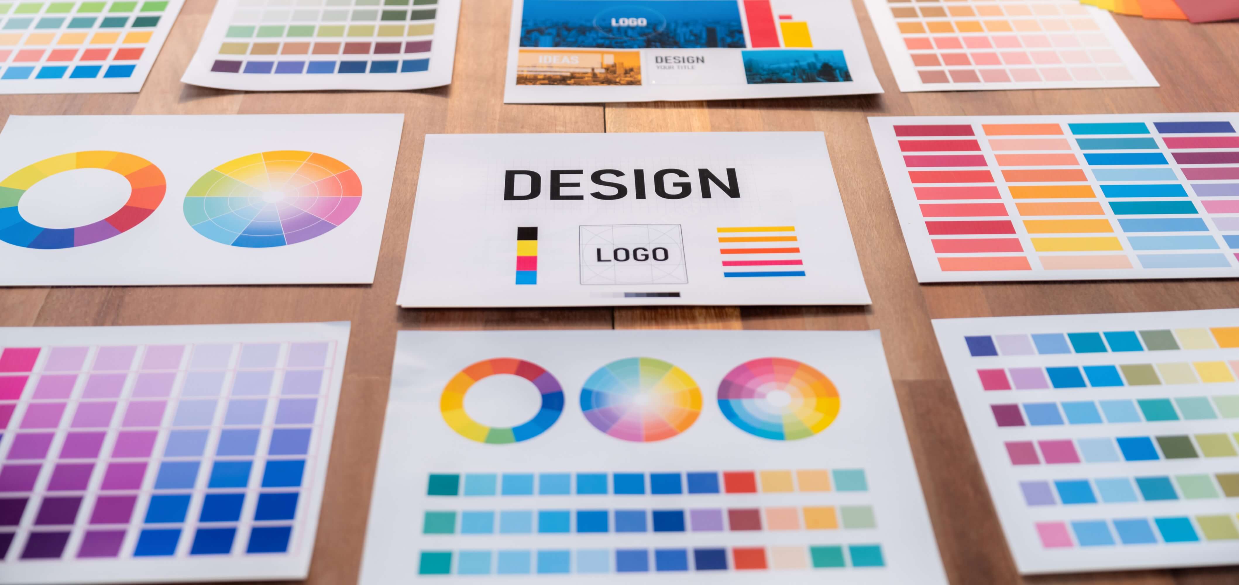
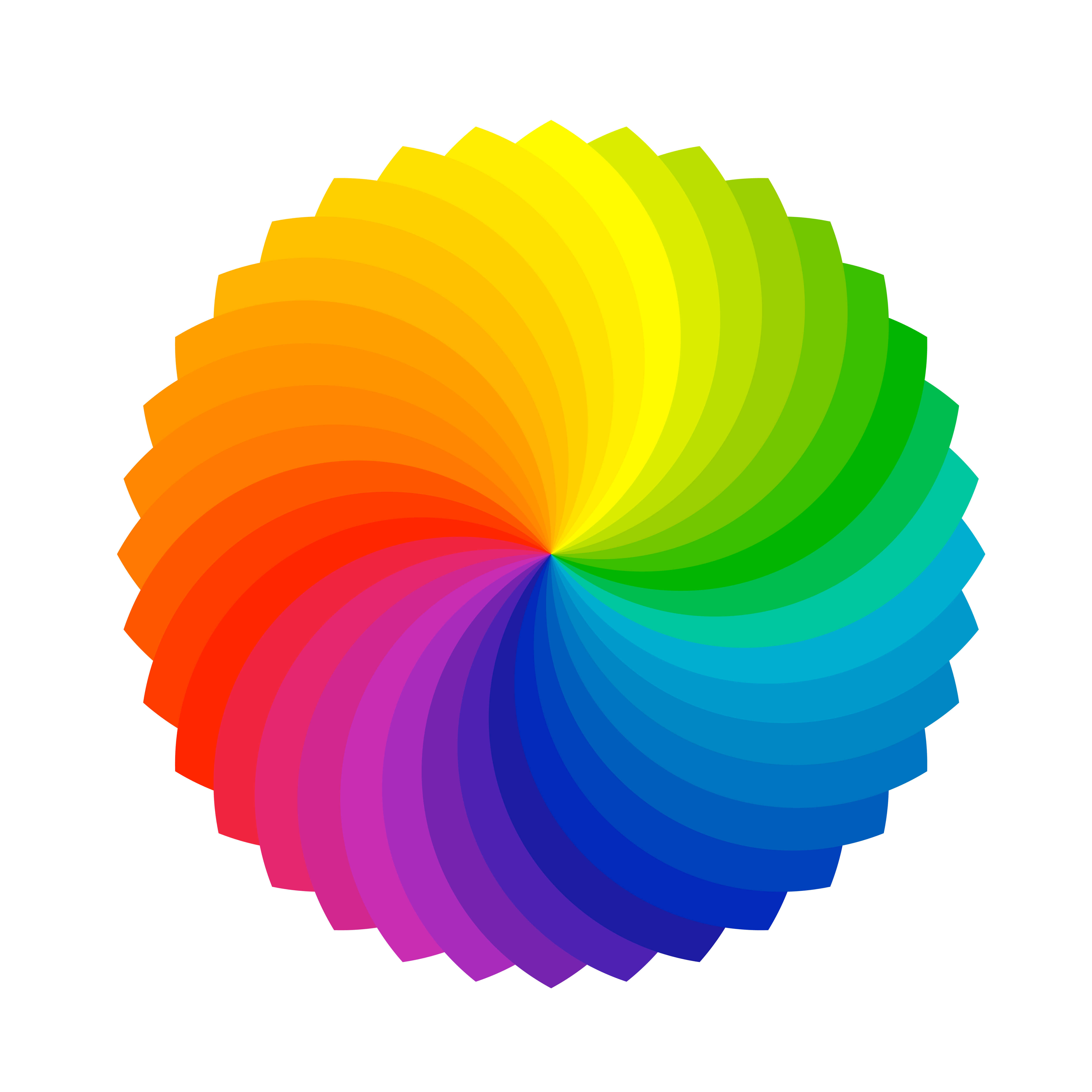
Designers use the color wheel to create harmony. By selecting colors with defined relationships—such as complementary, analogous, or monochromatic combinations, you create consistency, clarity, and rhythm.

Your visual identity is often your product’s first impression. The right use of color harmony communicates professionalism, enhances usability, fosters emotional connection, and increases conversions.
When colors clash or feel off, users may not consciously notice, but they often lose trust. Harmony helps ensure every element of your brand, from your landing page to your product UI, feels thoughtful and cohesive.
Different types of harmony create different effects. Let’s explore four practical approaches.
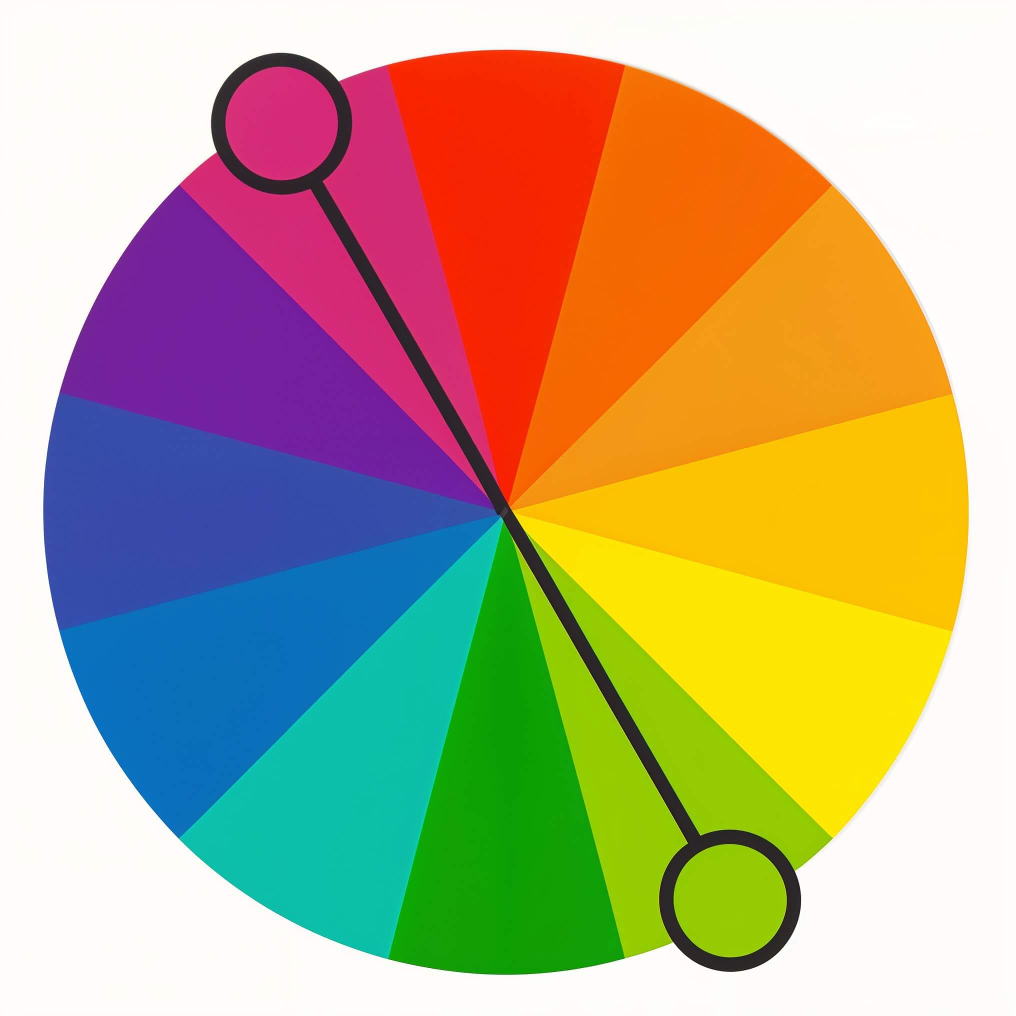
Complementary colors are opposite each other on the color wheel, like blue and orange. This approach offers high contrast, which makes it ideal for highlighting key elements such as call-to-action buttons.
Example: Slack uses purple as a base and complements it with orange or green accents in interface elements.

Analogous schemes use neighboring colors, like green, teal, and blue. They create a calm, cohesive experience and are great for backgrounds, illustrations, or mood-setting visuals.
Example: Headspace’s warm oranges and yellows evoke a sense of calm and positivity.
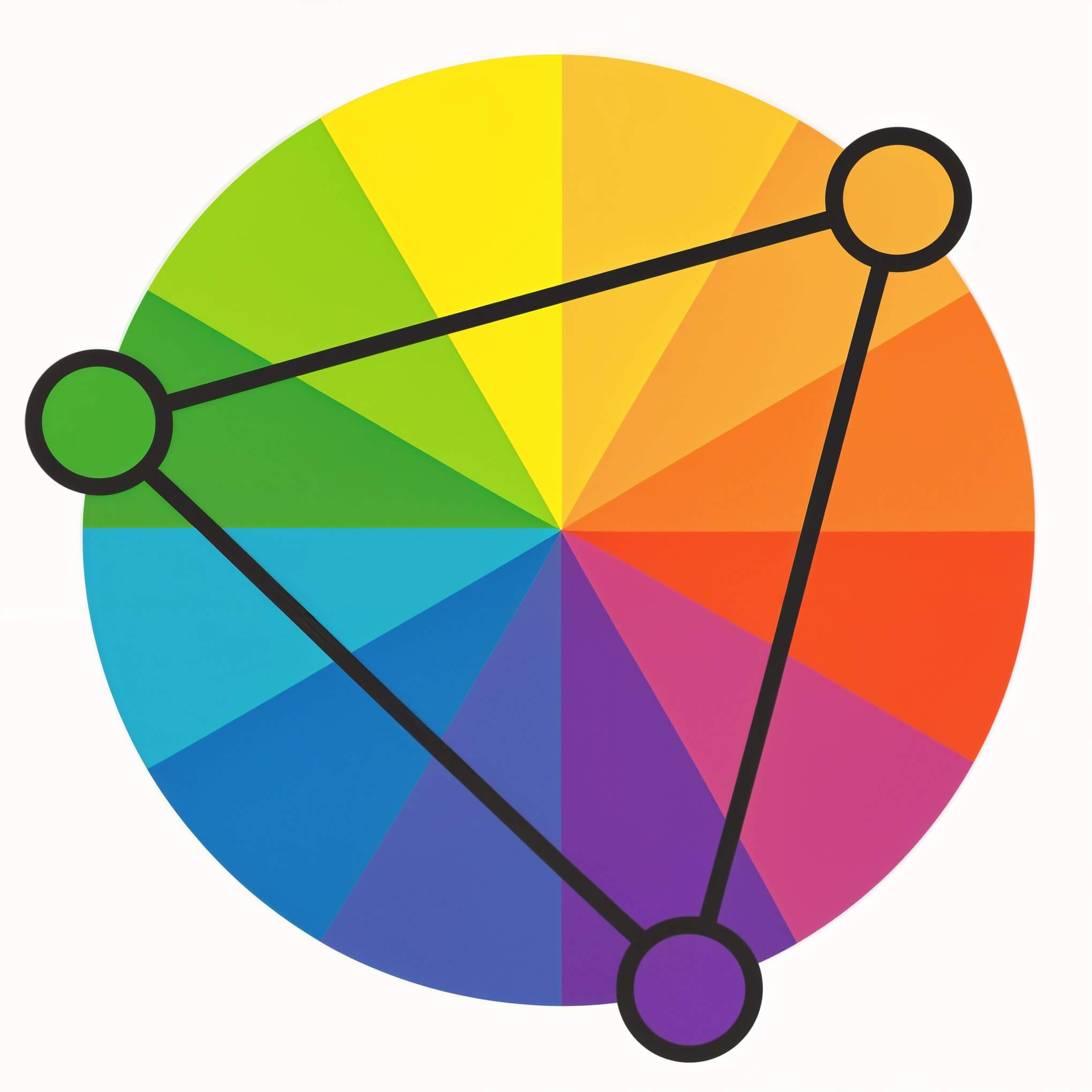
Triadic schemes use three evenly spaced colors on the color wheel. These combinations are vibrant and balanced, often creating a dynamic, modern aesthetic.
Example: Google’s logo features a triadic structure, red, blue, and yellow, with green as an accent.
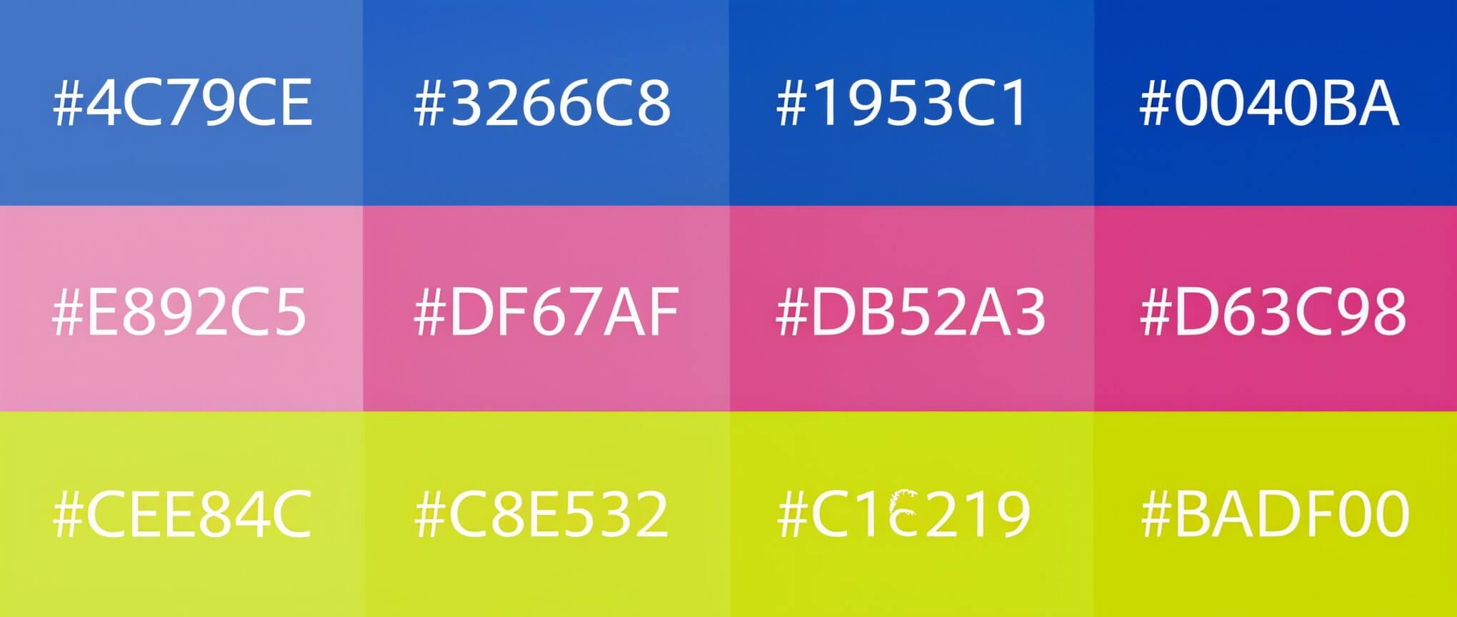
A monochromatic palette uses varying tints and shades of a single color. This minimalist approach works well for modern interfaces, dashboards, and neutral branding.
Example: Notion’s grayscale palette supports content-focused design and enhances clarity.
In user experience design, color must serve function as much as form.
Use color to establish hierarchy so users can easily identify buttons, navigation, or alerts. Test for accessibility with contrast tools to ensure readability across all users and devices. Color should also reflect the emotional tone of your product. For example, we use calm palettes for wellness or meditation apps, bold tones for financial tools, and playful schemes for community-driven platforms. You can explore how we approach UI work across industries like fintech, healthcare, and fitness. This kind of thinking underpins our UI design and UX design for early-stage startups.
A quick way to validate your palette is to convert it to grayscale. If your layout still communicates structure and emphasis clearly, your harmony is working.

Your brand palette should be more than just attractive, it should be strategic. Choose one primary color that represents your core identity, and build out accent colors based on harmony principles.
Make sure you document your color choices in a style guide that includes hex codes, usage rules, and examples. You can see how we handle this in our work on branding and identity systems.
Apply your palette consistently across your site, app, social media, pitch decks, and email templates.
This consistency builds brand recognition and supports scale as your startup grows.
DIY color palettes or auto-generated schemes may look trendy but often fall short when it comes to UX strategy and brand alignment.
At CC Creative, we build brand and product experiences that use color harmony as a foundation, not just for aesthetics, but for clarity, emotion, and usability. Our work turns design principles into real business outcomes.
If you’re launching a product or scaling a brand, let’s build something beautiful and functional together.
These tools are helpful for experimentation, but your brand deserves more than guesswork. A custom system aligned to your strategy will always go further.
Color harmony shapes how your users feel, what they do, and how they remember you. By using smart, strategic color choices, you create a more polished brand and a more intuitive product experience.
Want a color palette that does more than look nice? Partner with CC Creative.
.jpeg)
For start-up founders or growing business owners, apps offer a vast amount of opportunity....
View More.jpg)
A well-designed startup landing page is essential ...
View More.jpg)
Social media can be a great place to connect with friends, keep up with the news and trends ...
View More


